BRAND | ALIGN
ALIGNING ON A
NEW IDENTITY
McMillan renames and rebrands a construction industry innovator.
Challenge
After more than 30 years, Toolwatch had a well-earned reputation for the construction industry’s best tool-tracking software. But when they added labor, equipment, and safety to their construction operations solutions, the name was no longer big enough.
Insight
We watched Toolwatch align those solutions into a first-of-its-kind construction operations platform and realized that the same had to happen with the brand – they needed a name, look, and feel that would communicate the value of everything they had to offer.
Solution
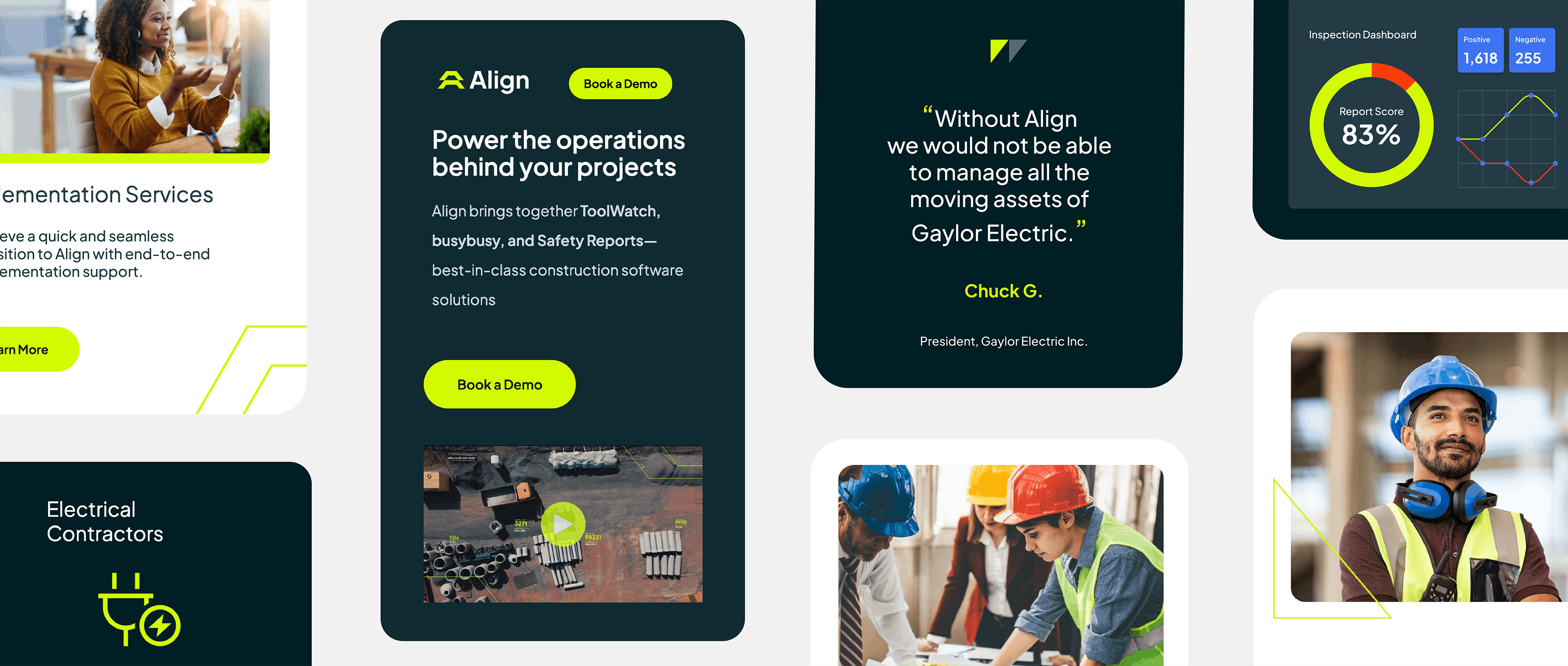
With all the alignment going on, the answer was clear: Align was the name—the robust foundation for a complete rebrand and an amazing opportunity for the company to create a deeper relationship with their existing customers and reach a whole new audience.
"OUR NEW ALIGN IDENTITY SPEAKS TO THE WAY OUR PRODUCTS ADDRESS KEY CHALLENGES CONTRACTORS FACE AND DRIVE OPERATIONAL PRODUCTIVITY. PERFECT."
TROY SUTTLE,
VP OF MARKETING
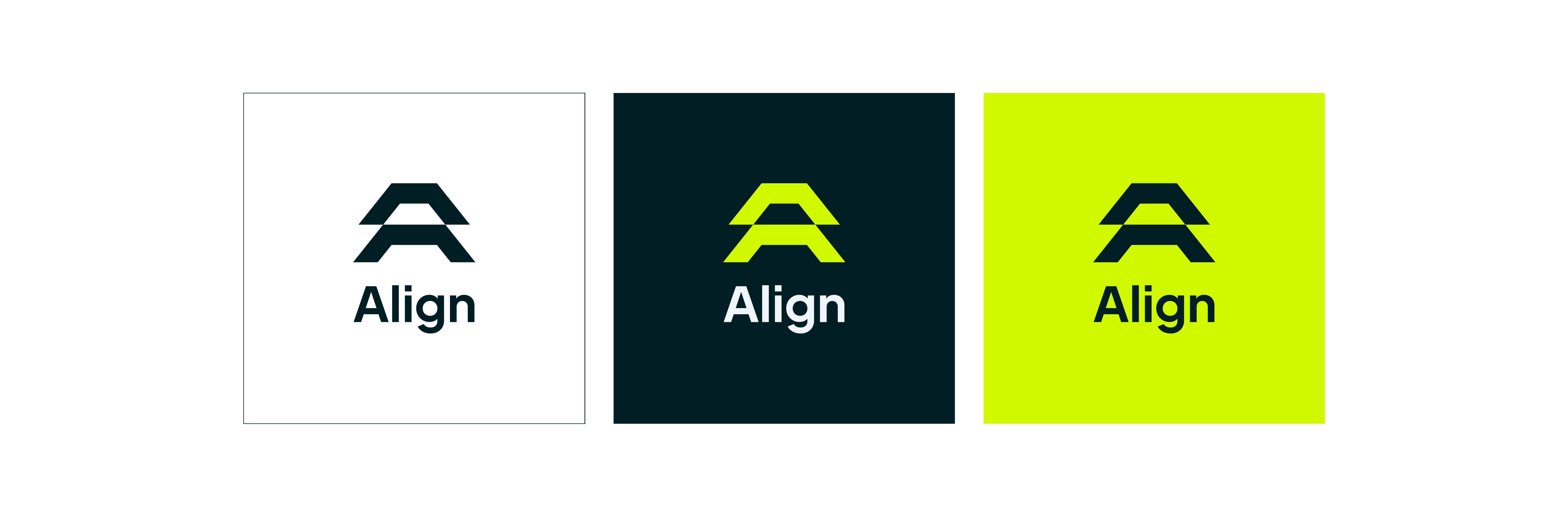
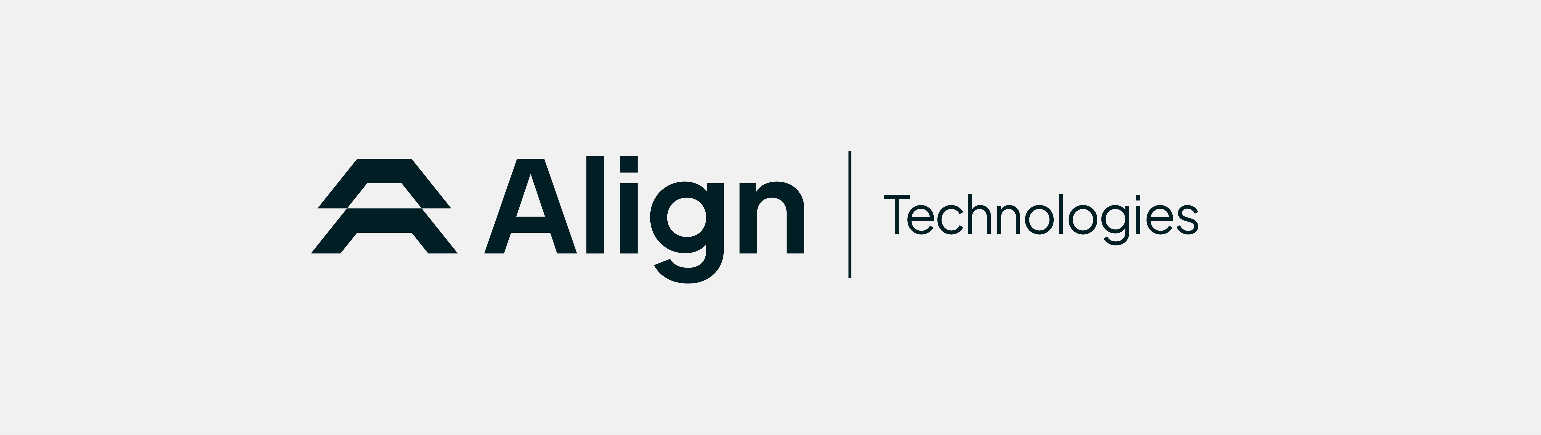
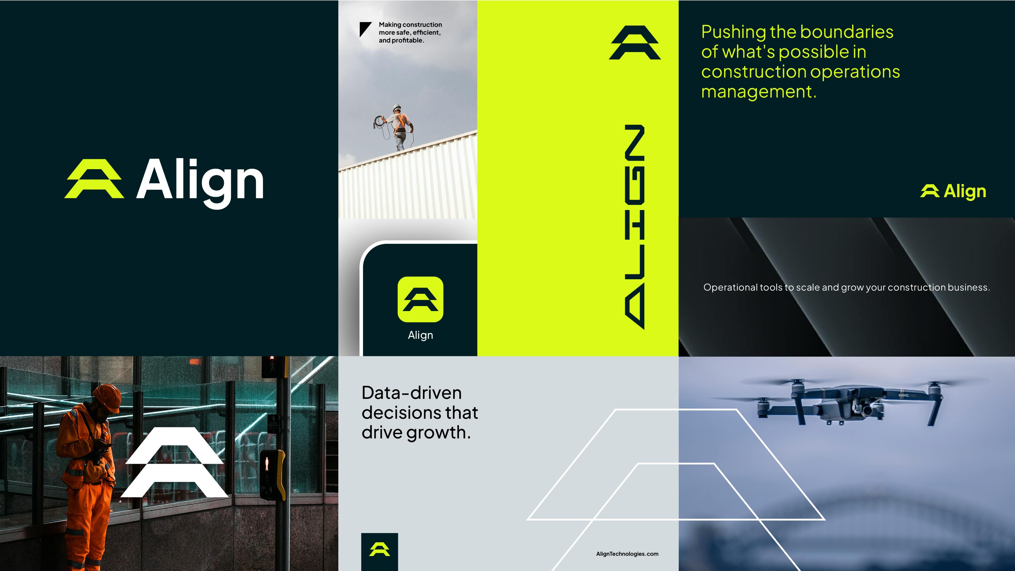
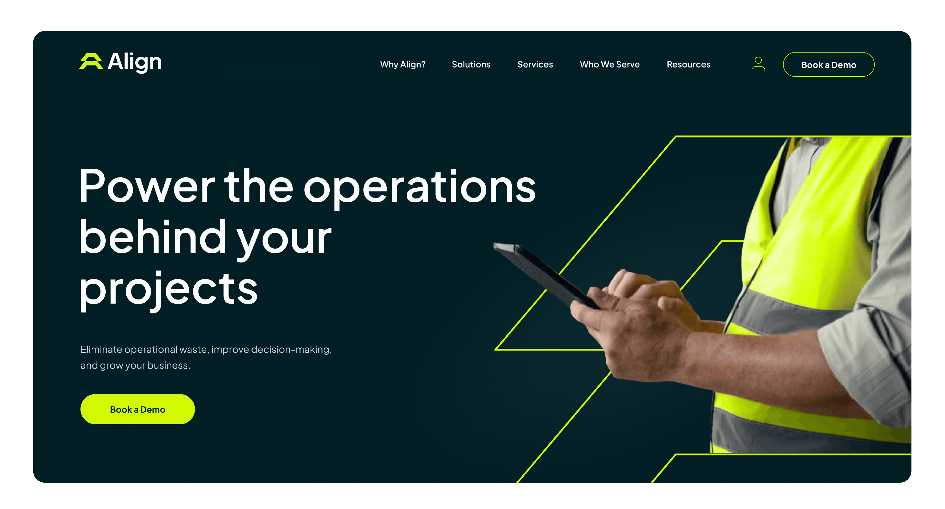
The Design System
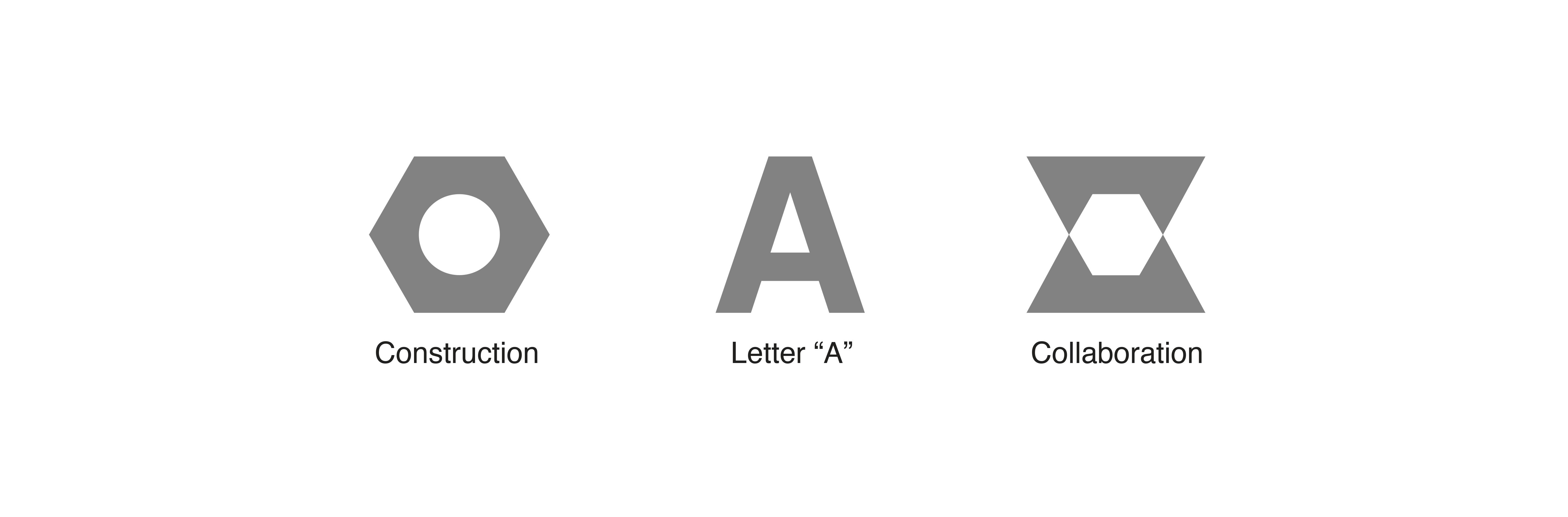
The logo symbol’s angular shape is derived from the recognizable outline of a heavy duty hex nut, combined with elements that are aligned to create a stylized A. The resulting negative space depicts the close collaborative relationship between Align and their clients.
A sleek, sporty, high-tech edge that plays well within the construction industry.
The attention-getting neon green echoes colours that are familiar on worksites—on tools, vehicles, and safety gear like vests and helmets.
The typeface is a rounded geometric and humanist sans-serif and has been customized to bring balance and clarity to the logo.

Website
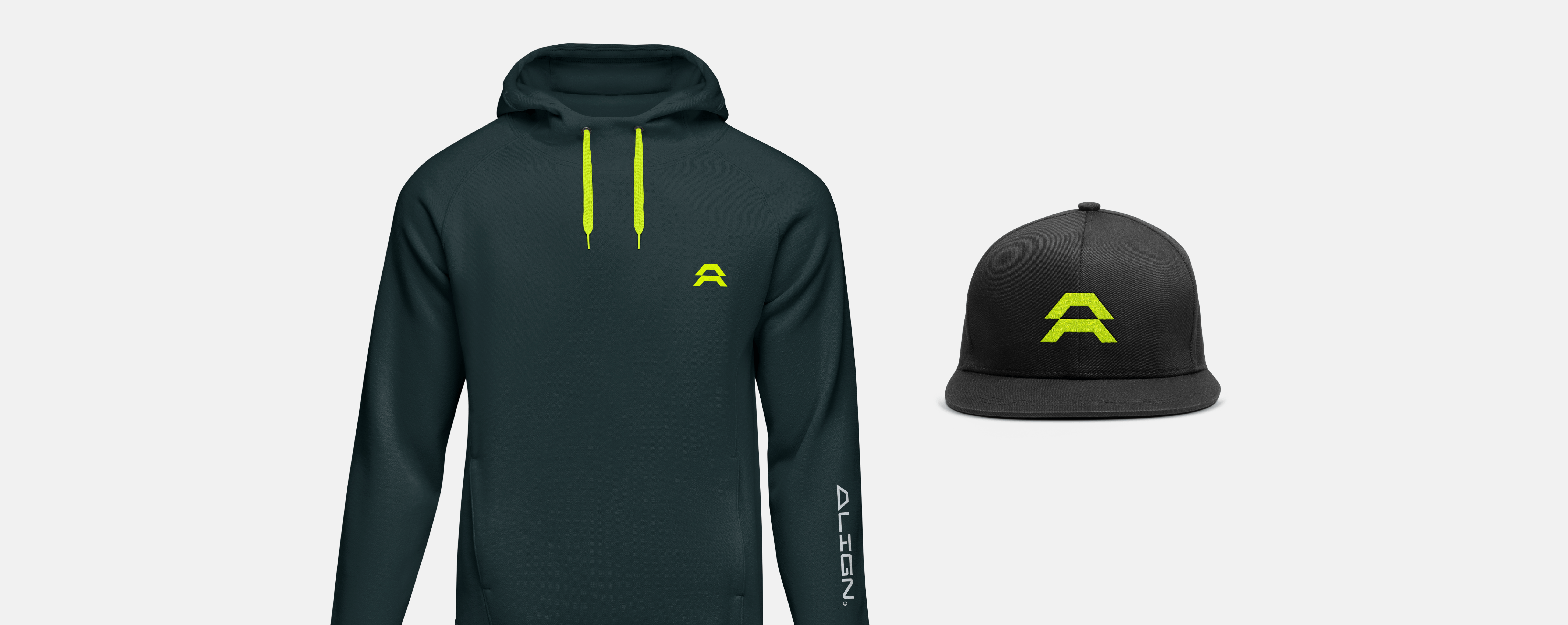
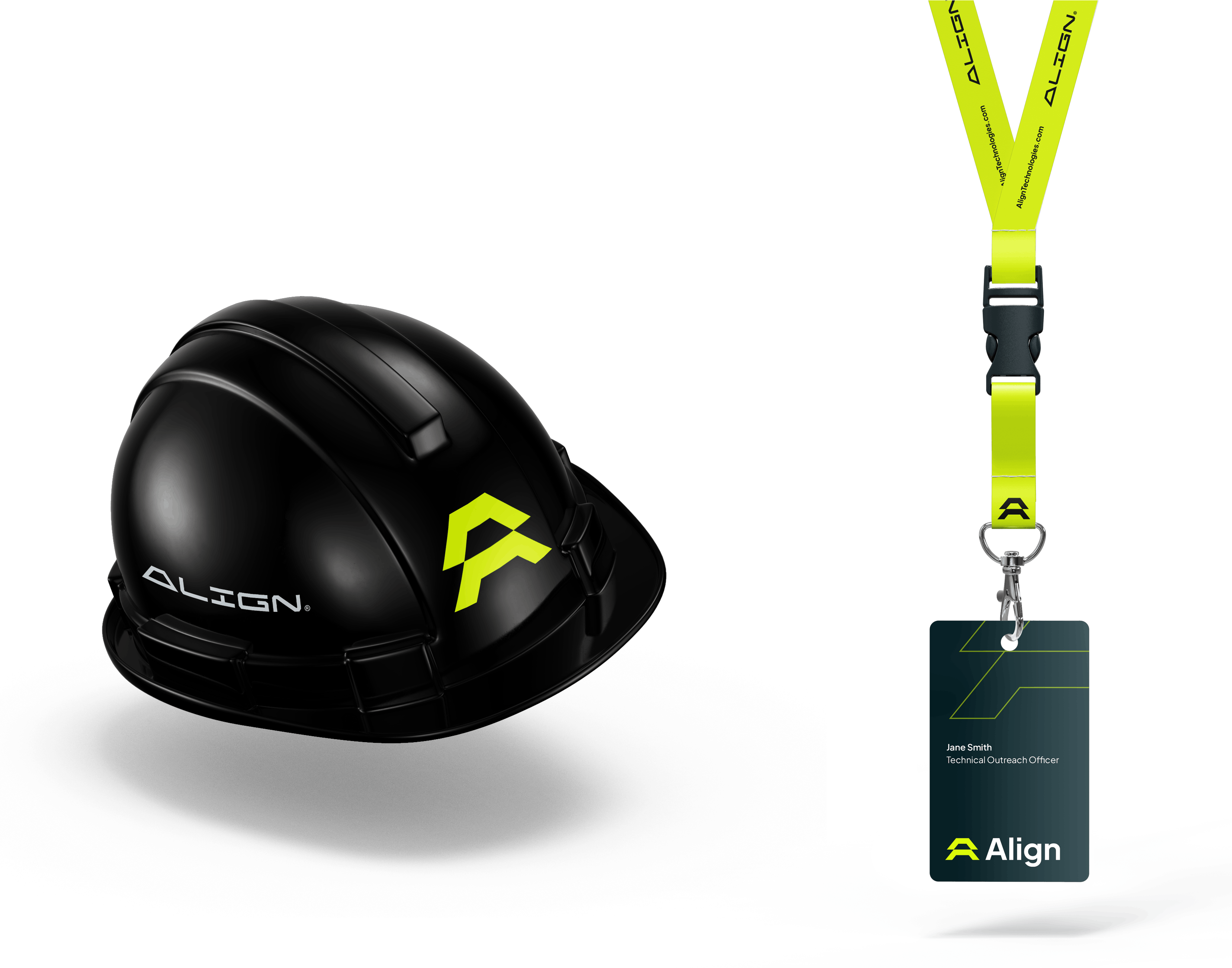
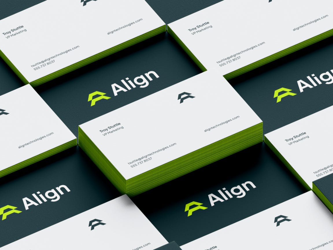
Brand applications