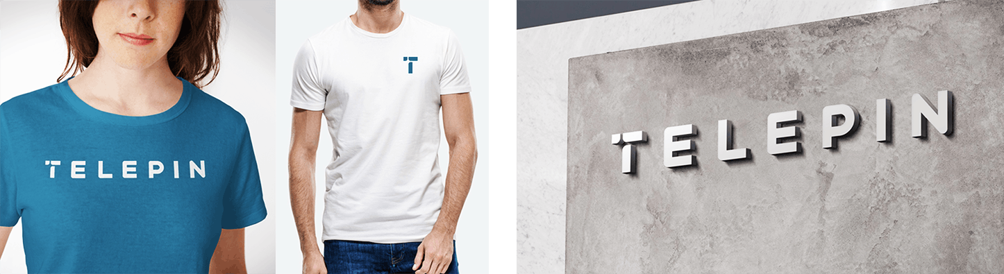
BRAND | TELEPIN
The human face
of mobile money
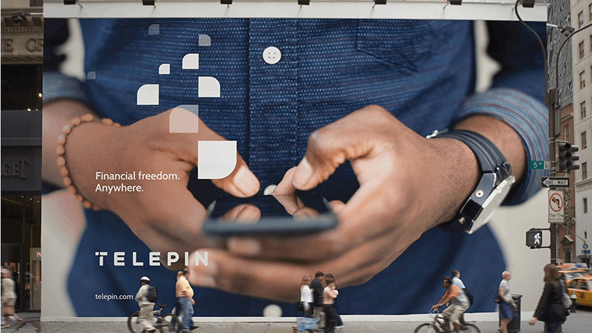
Digital payment technology creates financial freedom.
We put the spotlight on the users.
Challenge
As a leading provider of mobile money software, Telepin was helping telecommunications carriers around the world deliver digital payment solutions. To ensure its continued leadership position in its sector, Telepin wanted to reshape its image by building on its core strengths while looking to the future.
Insight
Mobile payment solutions are nothing short of revolutionary for many residents of developing nations and others who are unbanked. Telepin’s platform gives more than 250 million people a secure way to save money and pay for everyday goods and services. While Telepin’s technology is strong, the real story is how it changes lives.
Solution
We created a new brand identity for Telepin, delivered through a completely reimagined digital presence that focused on faces, not phones, and on the theme of financial freedom.
Graphic Elements
The layout shape is constructed to mimic the shape of the crossbar in the logo’s “T.” It functions both to hold content and crop images, and the two shapes together create a path that symbolizes the flow in a transaction.
The shape is duplicated and scattered to show Telepin’s presence in any environment, and arranged in an ascending column to represent a transaction taking place.


Web Presence and Collateral
Telepin’s reimagined digital presence and other collateral are supported by galleries of distinctively human, documentary-style photography, custom iconography, and type, all optimized for the mobile interfaces on which most people will experience the brand.