Challenge
ParetoHealth is the largest benefits captive manager in the U.S. As the company has grown, so have the innovations in employee health benefits for small- and medium-sized businesses. But the brand—a vestige of the "start-up" days—had not kept pace.
Insight
The company had brought an entirely new way of thinking to the employee health benefits market, but only their early-adopter clients knew it. To create the awareness required to scale the business to the next level, ParetoHealth needed to scale their story to one of category-creator.
Solution
We embedded ourselves in the ParetoHealth team and channeled our enthusiasm for the moment into a fresh, high-impact presence, beginning with a new corporate mark and core messaging, then delivered through a new website, library of videos and sales enablement tools.
Moving Forward Together
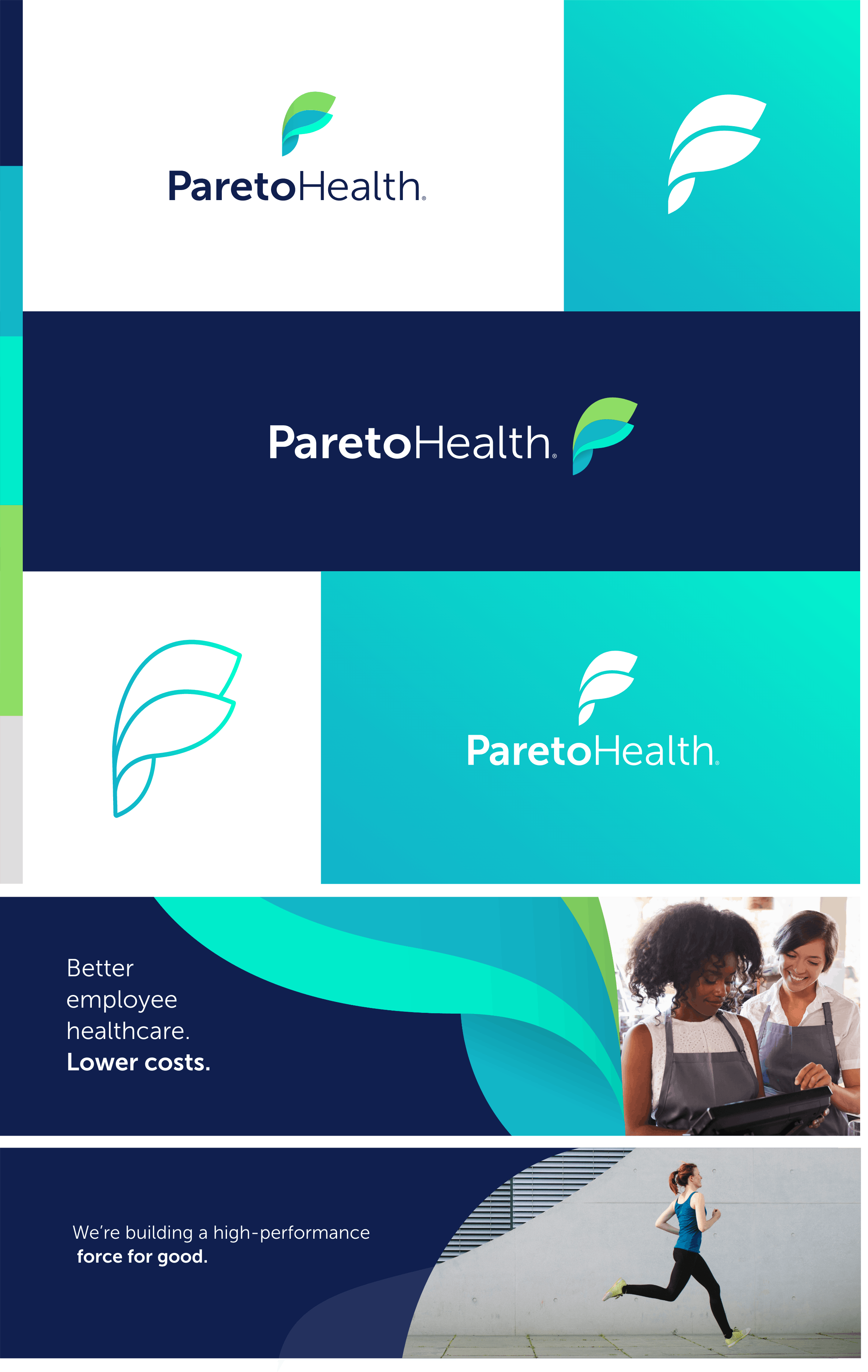
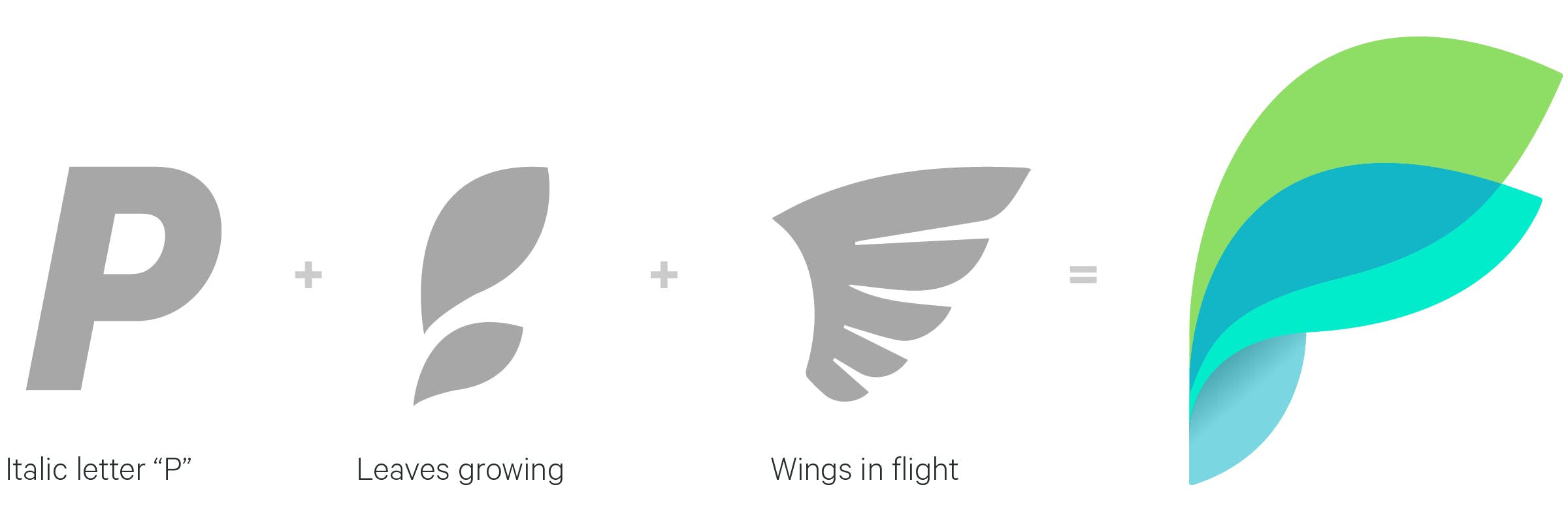
The logo mark is the foundation upon which the entire visual brand was built. It begins with the P. That letter yields a shape that resembles a petal or leaf, which then expands—or grows—organically into wings that mirrors the shape of the P. Bending forward, the form symbolizes the company's embrace and enablement of what is possible, while the overlap of the two shapes suggest the way it collaborates with employers and consultants to change the future of healthcare solutions.
The Design System
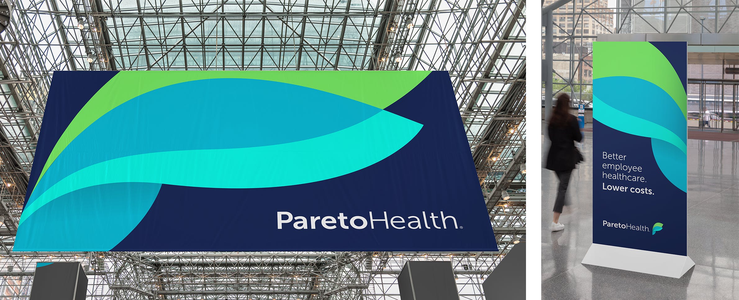
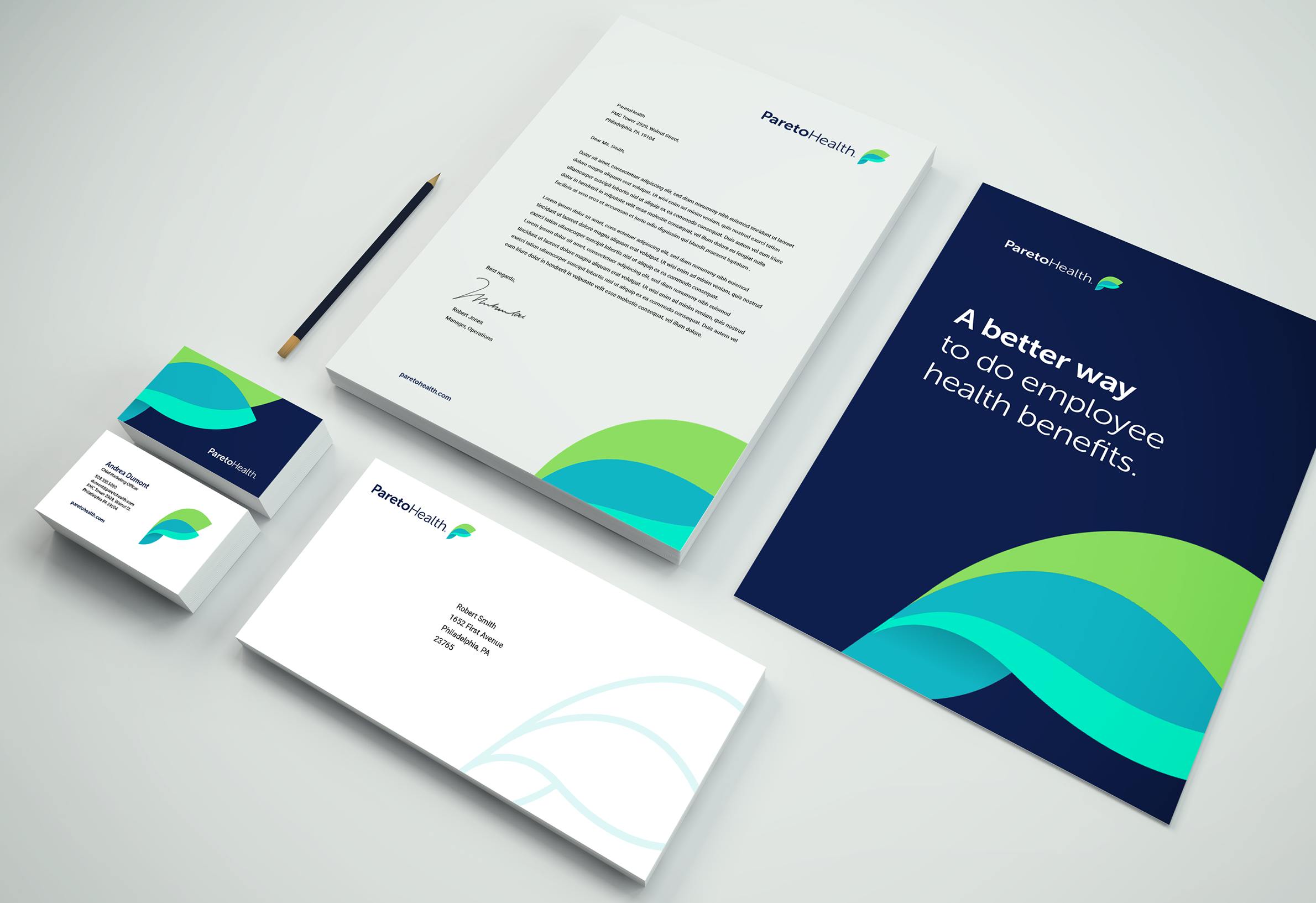
ParetoHealth needed a modern brand to reflect the new position of the company and differentiate itself from the typical sea of blue-greys of its competitors. It needed to stand out. We came up with a clean, bright design aesthetic that better represents some of ParetoHealth’s core characteristics: bold, positive, organic, and vibrant. And always moving forward.