BRAND | HUB INTERNATIONAL
A brand revolution
McMillan transforms a brand at the speed of entrepreneur.
Challenge
Years of break-neck growth through acquisition had led HUB International to a fragmented and dated brand experience.
Insight
We compared the company’s target audience to its brokers—many of them business owners before coming under the HUB banner—and discovered they share an entrepreneurial mindset.
Solution
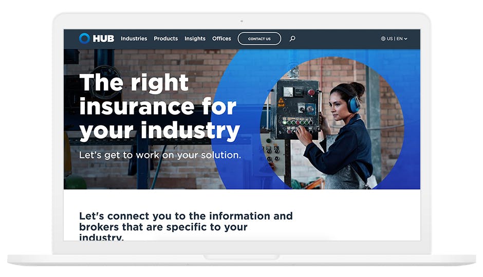
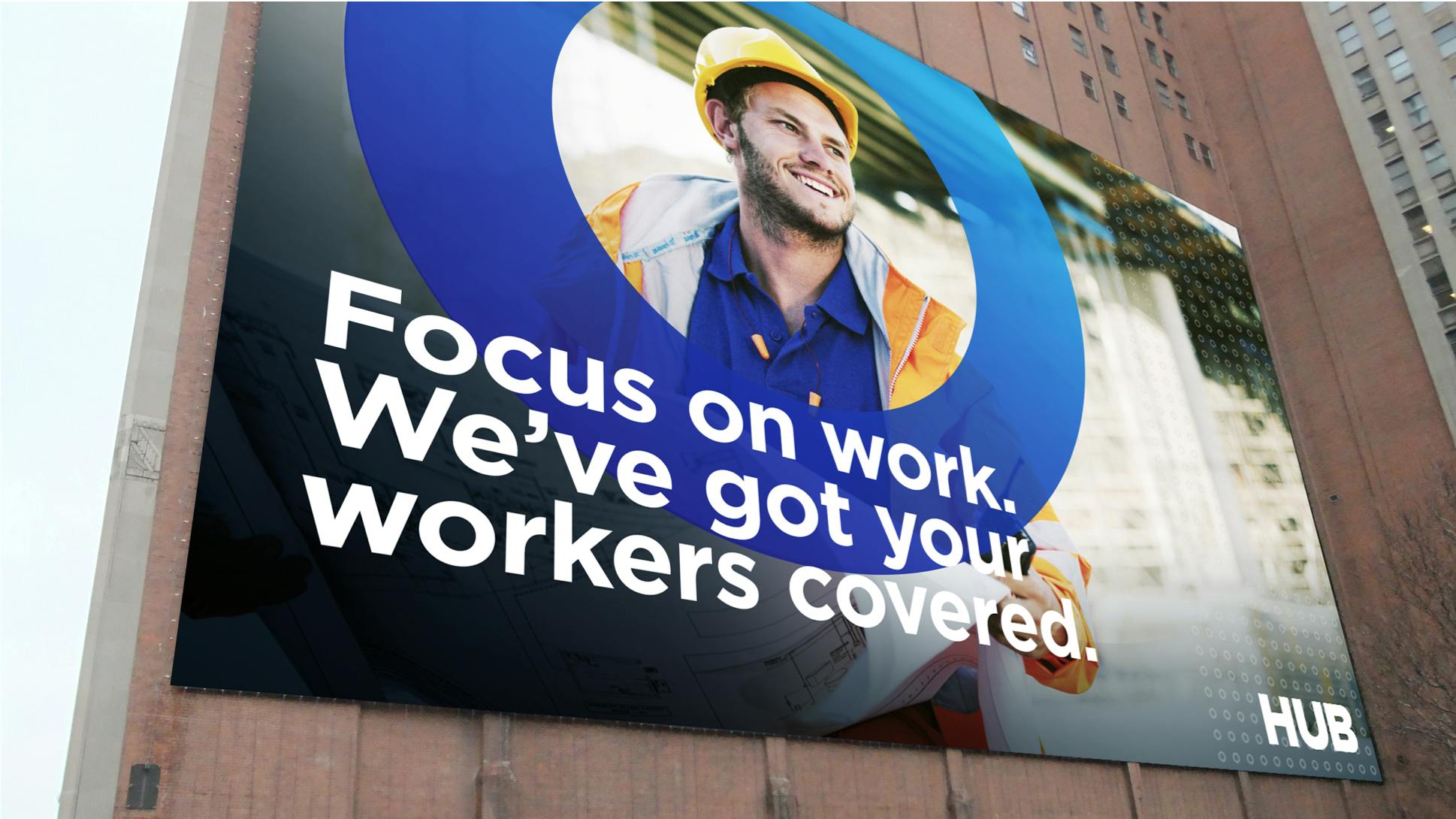
HUB wanted to move fast, so we went agile. We soft-launched the updated brand through an overhauled online experience and then via three go-to-market programs.
7,000+
new leads generated
17%
year-over-year increase in site traffic

Beyond the Circumference
We launched the rebrand in 2016 with an all new website and expanded into demand generation campaigns, social media and online experiences including a brand manifesto video that captures the HUB essence. And when HUB added retirement planning to their offerings in 2020, we created a sequel to that video that positions the brand right alongside their clients – ready for tomorrow.
Original Brand Manifesto
2020 Sequel